I’m just letting Art Brain wander right now. Which means I let her work on whatever is the most appealing at any given moment. Earlier this year I got an iPad Pro and have been working in the app Procreate to see if I can warm to digital illustration. Which is something I greatly admire and have wished was part of my skill set for a long while.
I’ve finally reached a point where I feel like the stuff I’m making there is worth sharing. There’s been a lot of really horrible art making during the learning process and as strange as it sounds, I’ve enjoyed that part. There is an element of freedom in failure that I have come to appreciate.
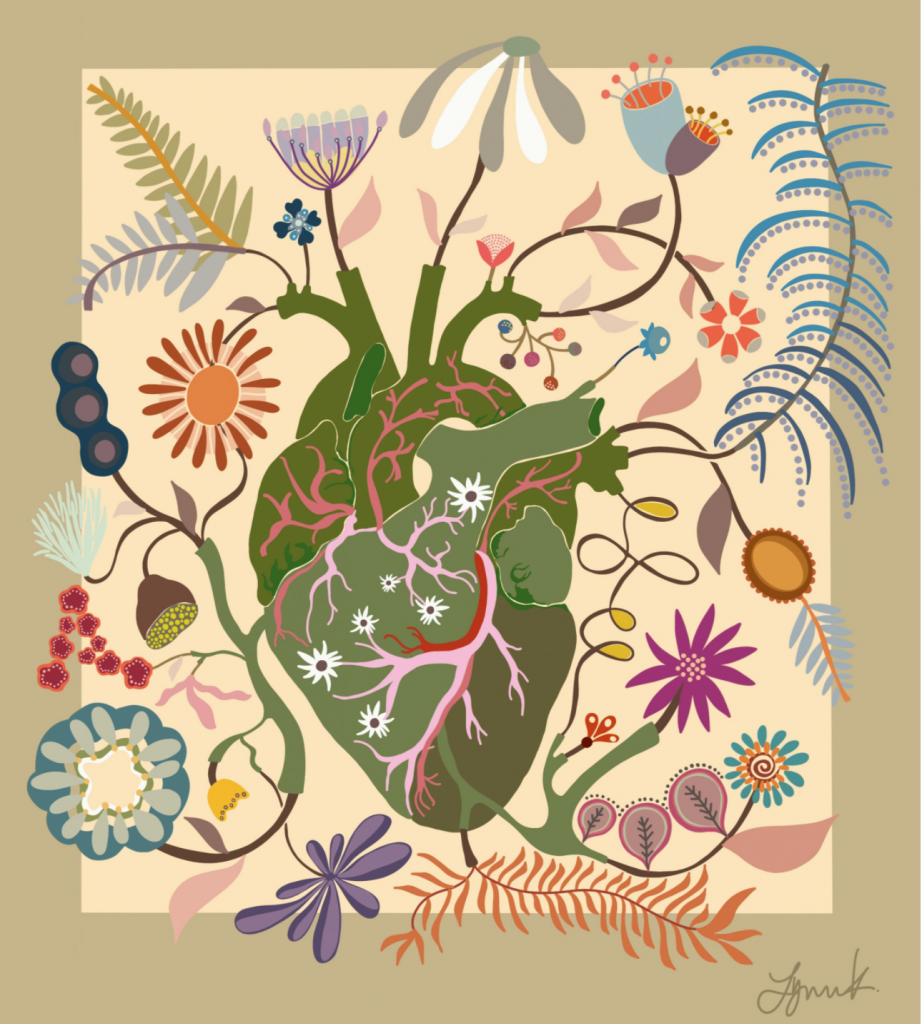
One of the things that I like about Procreate is being able to easily change the colors of elements to create variants. It changes the vibe of stuff and I’ve started doing some color study illustrations. I love color so much, just want to submerge myself in the subject. Below are two color variations of a recent illustration I completed called “Crazy Plant Lady’s Heartbeat”. I know which one I’m partial to. The only difference between them is the background colors. Which do you like better and why?
![]()
21 Comments
I like the dark background more. It makes me think of the darkness of the world contrasted with the vibrant world of the artist’s creativity
I love your ‘Crazy Plant Ladies heart beat”! Your wonderful color palettes and organic shapes inspire me! Thanks for sharing, Lynn.
Beautiful!!
Lynn, I like both of them but maybe like the darker one a wee bit more. I need to look at Procreate again. I took a class several years ago at the Quilt Show at Paducah and haven’t touched it since. Did you redo your website? Whatever you did, I LOVE LOVE LOVE it!
they are night and day; how do you choose? I really like them both but having to choose, I go dark. Both are very, very cool!
I have purchased Procreate too. I haven’t made much time to play with it, though. I like the dark one 100% better. I’m thinking that people who are partial to bright, bold colors will be attracted to that one, and people who are drawn to more subtle colors will like the lighter one.
I like the light background color. It makes it easy to see the design elements and adds to the playfulness of the interacting individual pieces
i like them both, but maybe the lighter one shows off all the elements better. both colorways are lovely!
I like the first one. The color reminds me of plants 🪴 and growing.
I like the second one best because the colors are more saturated and speak louder.
Hey Lynn, I really like the black background, as it makes the colors pop! And the illustration is so awesome all by itself!
The light one,. for me there isn’t enough contrast in the dark one and I always associate plants and flowers with sunshine
I prefer the second illustration with the purple/brown background. Deep, dark backgrounds make the other colors pop, thereby making the illustration more exciting.
Both are beautiful–but it is amazing how the different colored backgrounds have a different feel about them. The light background gives a soft feeling–the black–an intense feeling. What feeling do you want to give the viewer? I love them both.
I like the first one best. The plants/flowers are frolicking around the central object, the heart. The light background adds to the spring-like feeling.
I love the one with the dark background. The amped up contrast makes everything pop and I can see the composition more clearly. It seems like the light background in the other one takes my attention away from the elements instead of supporting them.
I am drawn to the second design. Using black on which to build the colors in your design lets the colors “pop.” rather than “just sit there” waiting for something to energize them.
Glad you are having fun with your new tools and techniques, Lynn. It’s always fun to see where your art journey takes you! I love the gentler light background version; makes my eyes and heart happy.
Normally I would granite to a black background but I think it looks too folk art therefore the beige background tends to accentuate the plants more
I really like both of them although I prefer the black/brown background. It makes the colors pop and reminds me of folk art. It looks like you’ve mastered the program! Brava!
I love love the dark background. The colors just pop! This is excellent. Love that you are spreading your wings and trying new and different things. Makes us artists really love the process.